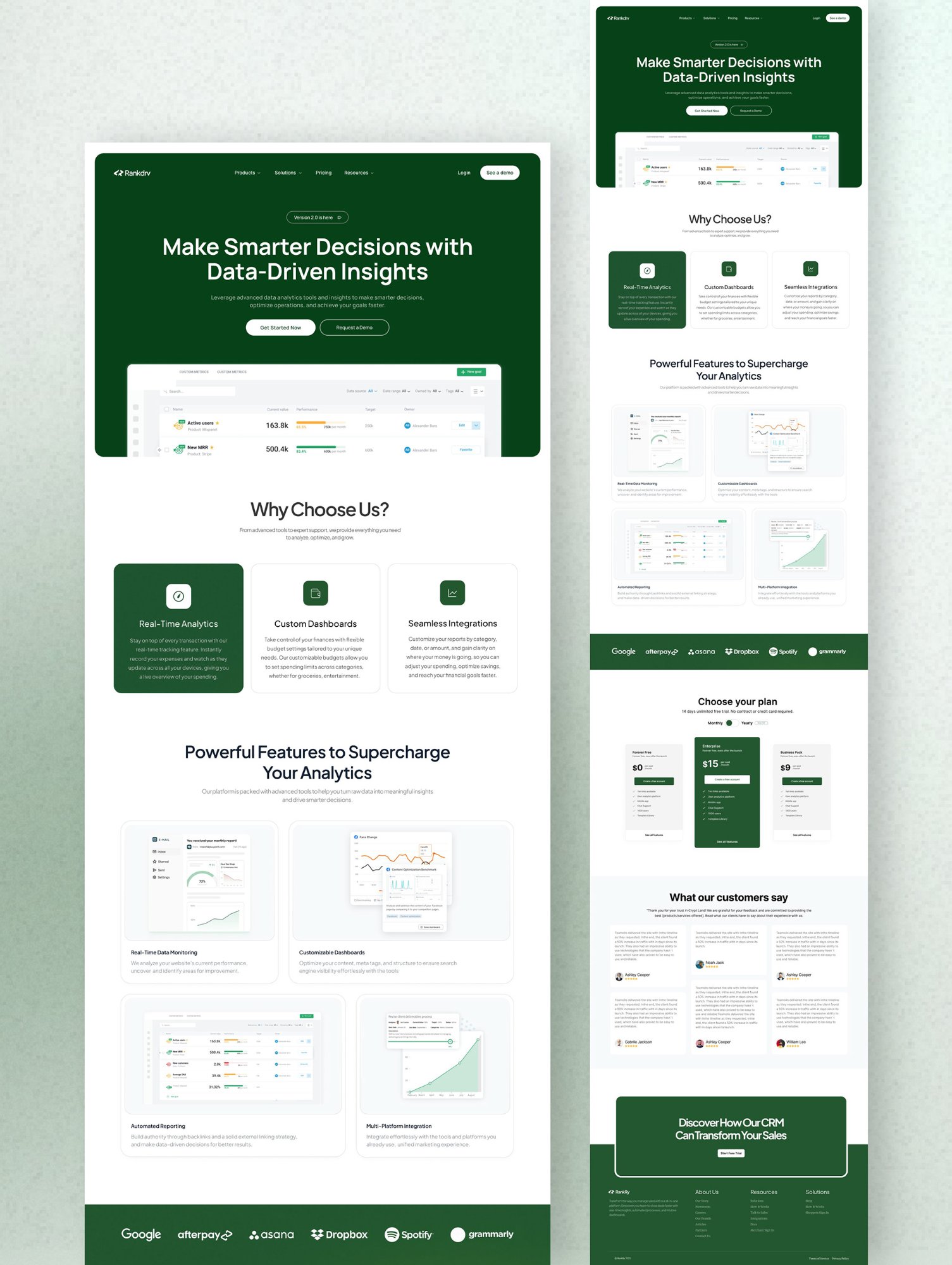
Designing an analytics and CRM platform that helps businesses make smarter decisions through real-time data, custom dashboards, and seamless integrations.
A business outgrowing spreadsheets ends up with revenue in Stripe, pipeline in a CRM, traffic in an analytics tool, and ad spend in three dashboards that never agree. Each tool answers one question well, but no single surface answers the one that matters: what should I do this week? The work of stitching numbers together falls on the founder or an ops lead, usually by exporting CSVs into a spreadsheet on a Friday afternoon.
The design problem is not a shortage of data. It is signal. The hardest challenge in an analytics and CRM product is information density: showing enough to be trustworthy without burying the one number that should change a decision. Enterprise BI tools solve this with a dedicated analyst. Growing teams do not have one, so the interface has to do that job.
Founders, ops leads, and marketing managers at 10-50 person teams who own decisions but are not analysts
An analytics and CRM surface with real-time dashboards, custom reporting, and integrations across the tools they already use
As teams outgrow spreadsheets but cannot justify the cost or setup of enterprise BI
Desktop web, monitored daily and used for deeper analysis at weekly and monthly reviews
Decisions stall while data sits in silos; pulling a single view together takes hours of manual work
Progressive disclosure for density, sensible defaults, customizable reports, and a clear hierarchy that leads with the decision
I ran nine interviews with founders and ops leads at small and growing companies, sat through three of their weekly metric reviews, and audited six dashboard and CRM tools to map how each one handles density and the path to a decision. The pattern was consistent: the data existed, but getting to a usable read of it was slow and manual.
Seven of nine interviewees rebuilt the same cross-tool report by hand every week. The recurring question was never "what is the number" but "is this number good, and compared to what."
People described stock dashboards as wallpaper. Without a baseline or a clear "so what," a wall of widgets read as noise and got scrolled past within days of setup.
The competitive audit showed the drop-off is at connection and configuration, not analysis. Empty states asked users to design their own dashboard before the product had earned any trust.
Ops leads wanted more on screen, not less; founders wanted less. The same product has to serve both without forcing one to feel cramped or the other overwhelmed.
"Just tell me what changed and whether I should care. I do not have time to be an analyst."
"I live in this thing daily. I want depth on demand, not a tool that hides everything behind three clicks."
"I will set up the integrations once. After that it should run without me."
Every choice traded something off. The throughline was the same question from research: how do you get a non-analyst to the right decision quickly without starving the power user of depth.
The default view leads with a small set of decision-grade numbers, each with a baseline and direction. Detail, breakdowns, and raw tables live one interaction deeper. Tradeoff: power users hit one extra click for depth, so I made that click predictable and persistent rather than hiding it in a menu.
New accounts land on a pre-built dashboard tied to their connected sources, not an empty grid. Tradeoff: defaults can feel generic, so they are fully editable; the goal is to earn trust in the first session, then let people make it theirs.
Reports are composable from a fixed library of vetted blocks rather than a freeform builder. Tradeoff: less raw flexibility, but every report stays legible and exportable, and no one builds a chart that lies.
Layout puts "what changed and is it good" first, the metric second, and the chart third, reversing the usual chart-first dashboard. Tradeoff: it looks less like a classic BI tool, which I validated was a feature, not a bug, in testing.
The dashboard opens on a decision summary, surfaces the metrics that moved against their baseline, and keeps depth a single click away. Integrations connect from a guided setup, and reports assemble from vetted blocks.
I ran moderated usability sessions with 11 participants across the three personas, using realistic connected data. Tasks covered first-run setup, finding a specific metric and its trend, and building and exporting a report.
The first build packed eight metrics into the top row. Founders could not tell which one to look at, the exact density problem from research. I cut it to four decision-grade metrics with the rest moved one level down. Time-to-insight dropped 42% against the first build, and "I do not know where to look" comments disappeared.
Users connected a source but were not sure it worked. I added an explicit sync confirmation with the first rows of data, which lifted setup-task completion from 71% to 88%.
Leading with "what changed and is it good" tested well across all three personas. Power users wanted the depth, found it one click away, and stopped asking for a denser default.
These are outcomes measured in usability testing and design validation, not live production metrics. They reflect how the prototype performed against a baseline build with the same data.
Median time to answer "is this metric good" fell after trimming the summary row and adding baselines. Still slower than target for first-time users, who paused on unfamiliar metric names.
Across core tasks, up from 74% in the first round. Report building lagged the rest and remains the main area to tighten in a next pass.
System Usability Scale across 11 participants. Founders rated reading the dashboard highest; ops leads pushed for even more density on demand.
A launch set covering the sources interviewees named most, with a guided connection flow validated in testing. Breadth beyond this is a roadmap question, not a design one.
The instinct to show everything is what makes analytics tools fail. Deciding what not to show first, and where depth lives, was the highest-leverage call in the project.
Founders and ops leads want opposite amounts on screen. Progressive disclosure let both feel served, but I would test the depth affordance harder next time; report building was the weakest task and deserves another round.