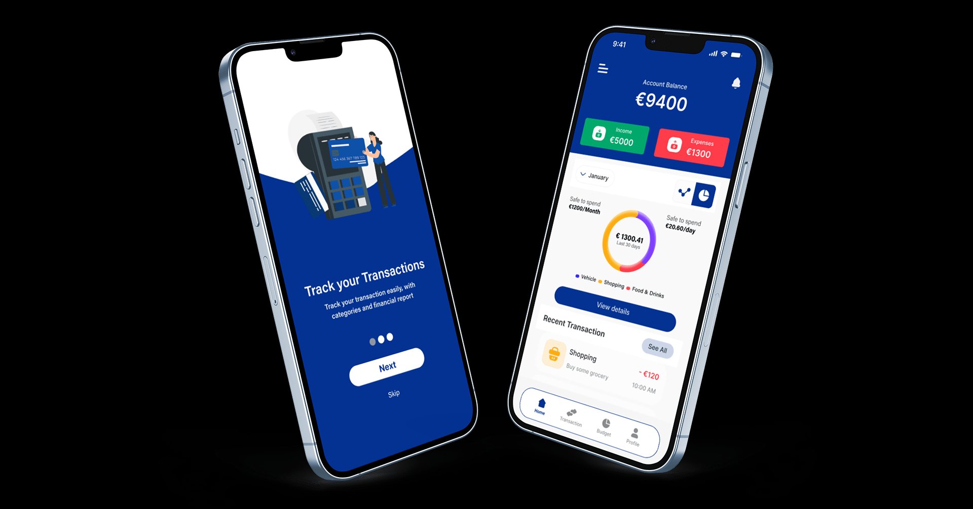
Managing multiple cards and tracking expenses requires too many apps. PayWise brings card management, real-time tracking, budget categories, and savings goals into one clean mobile interface for people who want financial clarity without the effort.
People do not avoid budgeting because they cannot do math. They avoid it because the tools make them do the work: open an app, tag a transaction, reconcile it against last month, and only then learn whether they overspent. The answer they actually want, "am I okay to spend right now," arrives last, if at all. The brief was less about adding features and more about moving that answer to the front and cutting the effort it takes to get there.
Young adults (18-35), freelancers, and small business owners managing multiple cards and accounts
A unified mobile app for card management, expense tracking, budgeting, and savings goals
Daily financial decisions: spending, saving, budgeting, and tracking across multiple payment methods
Mobile-first, used at point of purchase, during commutes, and during monthly budget reviews
Most people surveyed (68.4%) do not track expenses at all. Existing tools are fragmented across 5+ apps
Auto-categorized transactions, visual budgets, safe-to-spend indicators, and a digital card wallet
I ran a quantitative survey covering demographics, expense tracking habits, and feature priorities. Followed with 6 in-depth interviews to understand the emotional relationship with money management.
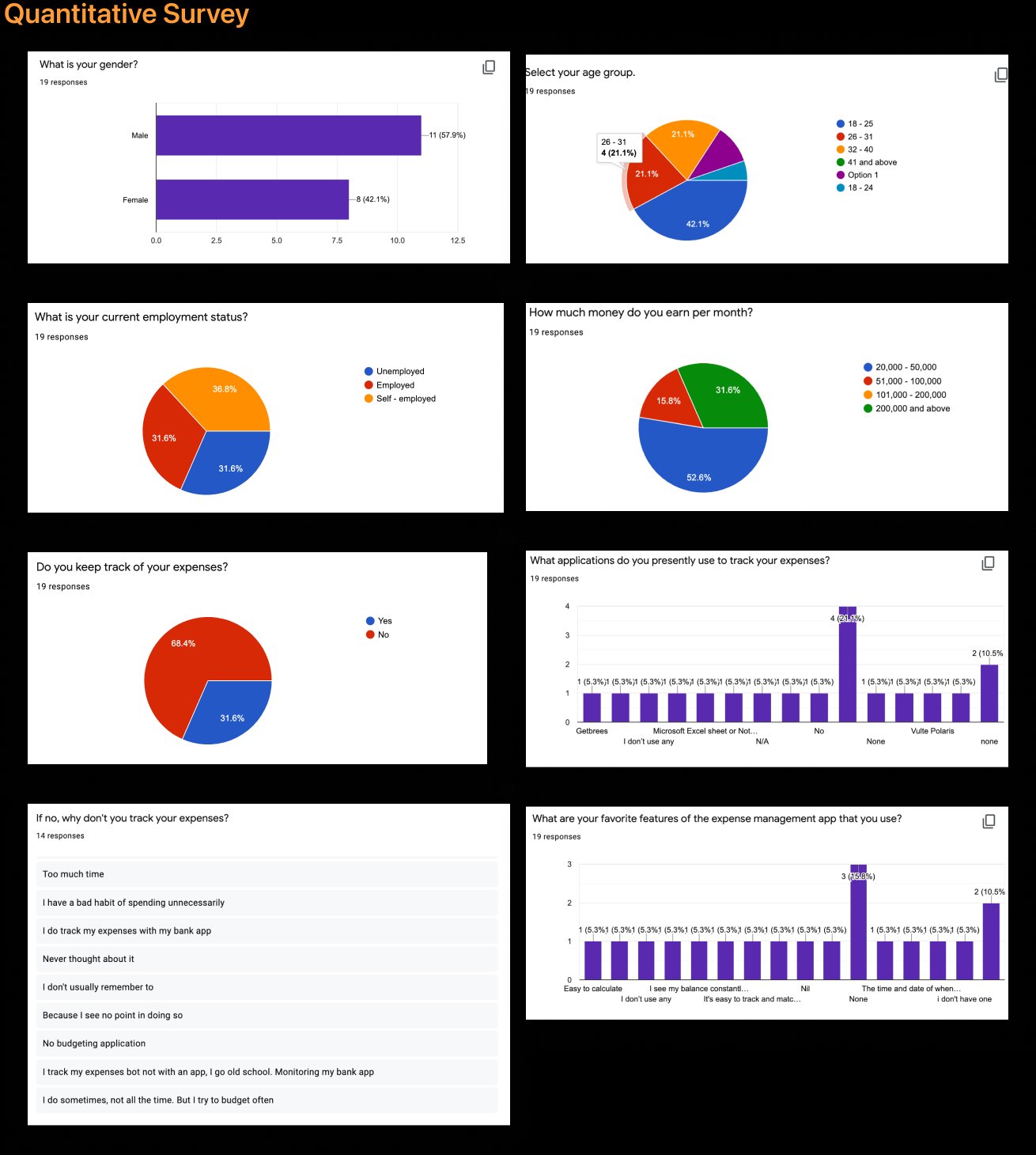
68.4% do not track expenses. Primary reason: "too much time." 42.1% aged 18-25. Employment split evenly across employed, unemployed, and self-employed.
Users feel guilt about spending but lack visibility. They want to know "am I on track this month?" at a glance, not after 10 minutes of spreadsheet work.
"I have no idea where my money goes each month."
"I have 3 cards and no idea which one I should be using when."
"I need to separate business and personal expenses but it is all mixed up."
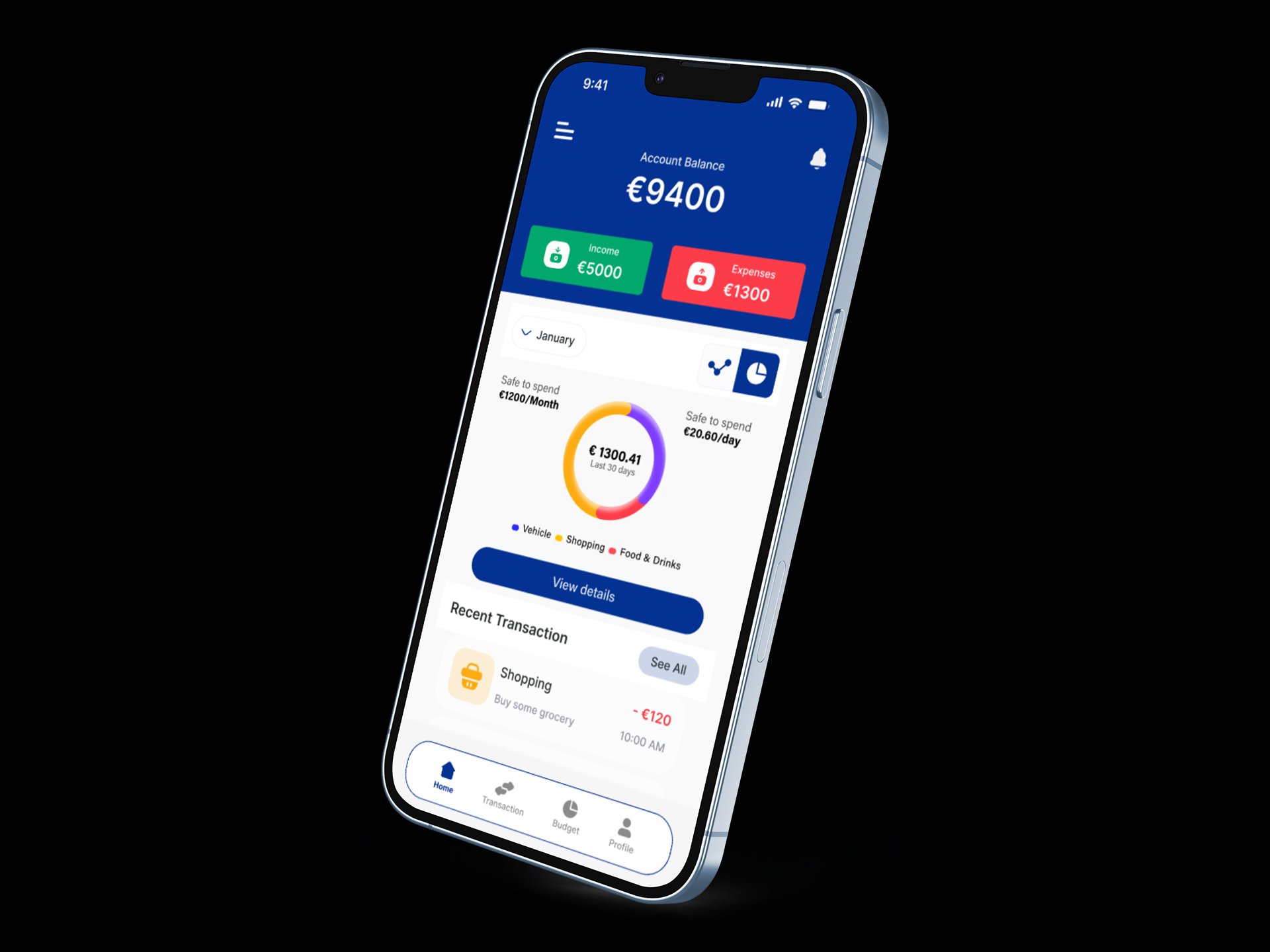
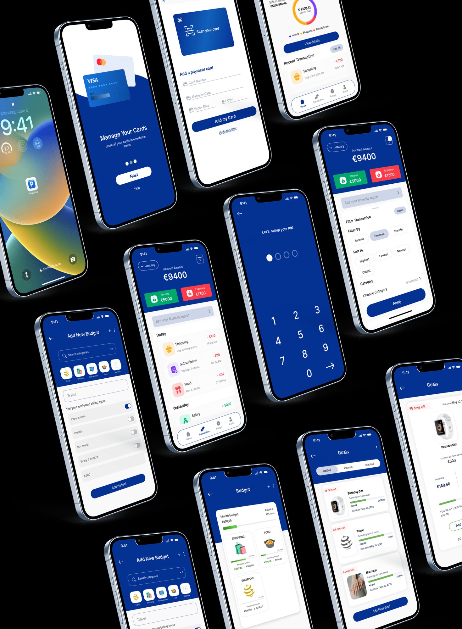
The home screen shows total balance, income vs. expenses, and a "safe to spend" indicator. Transactions auto-categorize. Budgets show progress visually. Goals track savings with clear timelines.
Each choice below traded something away. I tried to name the cost instead of pretending the easy path was free.
The home screen answers the one question people open the app for, before showing the full transaction list. Tradeoff: a single computed number hides nuance, so it can feel reductive to power users who want the line items. I accepted that to win the majority who never make it past the first screen.
Transactions sort themselves so nobody has to tag a coffee. Tradeoff: automation guesses wrong sometimes, and a confident wrong label is worse than no label, so categories stay editable and corrections stick. I chose low effort with a visible escape hatch over perfect accuracy that demands constant input.
Budgets show as filling bars rather than tables of numbers. Tradeoff: I lose the precision and exportability a grid gives, but a glanceable bar is read in a second at the point of purchase, which is the only moment the budget actually changes behavior.
All cards live in a single view that rolls up to one total. Tradeoff: merging cards blurs which account a purchase hit and adds real reconciliation work behind the scenes, but it is the only way the app answers "where do I stand" instead of being five banking apps stacked together.
9/12 users said it changed how they think about money. It replaces anxiety with a concrete, instant answer.
Users wanted quick filters like "This week" and "Food only" instead of building custom filters from scratch.
The first build asked users to define every budget category before the app was useful, and several quit at that wall. I flipped it: the app now proposes starter budgets from detected spending, and setup becomes editing a draft instead of facing a blank form. The same draft-then-edit move that worked for transactions had to apply to onboarding too.
The "safe to spend" feature worked because it replaced anxiety with a concrete answer. Design for the emotion, not just the data.
No one wants to tag every coffee purchase. The moment we automated categories, daily engagement jumped. Reduce effort, increase value.