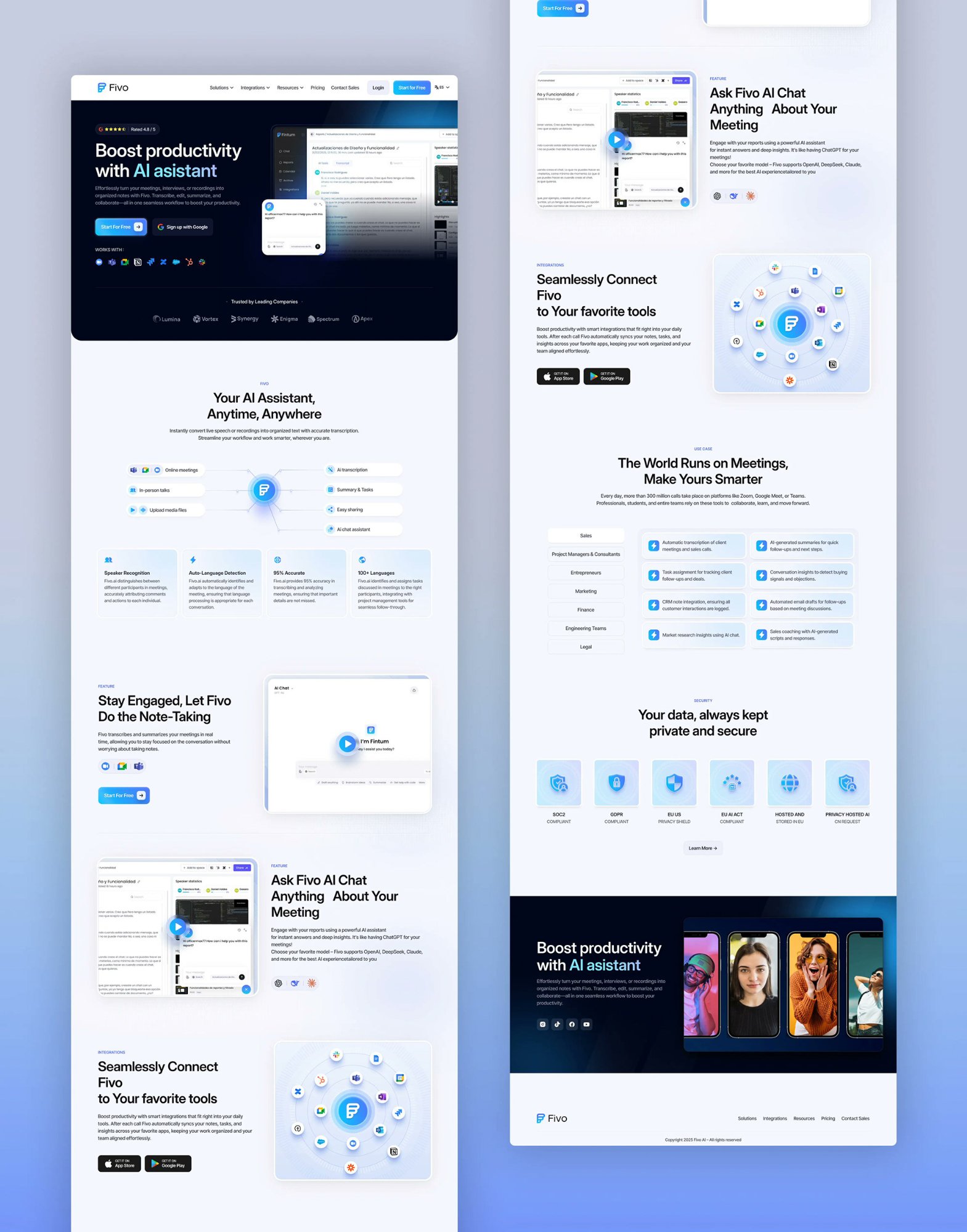
Redesigning the marketing site for an AI meeting assistant. Transcription, smart summaries, and team integrations positioned against Otter.ai and Fireflies.
Fivo had a working transcription product and steady inbound traffic, but the marketing site and onboarding leaked most of it. People landed, could not tell within a few seconds why Fivo was different from Otter.ai or Fireflies, and left. The team read this as a product gap. The funnel data said it was a positioning and onboarding gap. My job was to make the value legible fast, then carry that clarity into a sign-up flow short enough that people reached their first transcript.
Team leads, PMs, and independent consultants sitting in 4 to 8 meetings a day
An AI meeting assistant: live transcription, structured summaries, and integrations with the tools teams already run
Remote and hybrid work is permanent and meeting load keeps climbing across roles
Desktop web, during and right after calls; the marketing site is the front door
The old homepage to sign-up funnel dropped roughly 7 in 10 visitors, and most never reached a clear reason to stay
Lead with integrations and concrete outcomes, prove trust early, and cut the sign-up flow to its first useful moment
I ran three things in parallel: a competitive teardown of Otter.ai and Fireflies, a funnel analysis on the existing site, and eight user interviews with people who take notes in meetings for a living. The methods were modest by design. With a small sample I leaned on triangulation, treating a finding as real only when interviews, analytics, and the competitive read pointed the same way. I did not have a large panel or A/B infrastructure, so I am honest that the testing below is directional, not statistically conclusive.
Otter and Fireflies both lead with the integration and the workflow, not the transcription engine. Fivo led with accuracy claims, which read as a commodity feature buyers already assume. The real differentiator, deeper integration into existing tools, was buried below the fold.
The steepest drop was on the homepage itself, before any click. A second cliff sat inside sign-up, which asked for workspace details up front. People bailed before they saw a single transcript.
In interviews, people skimmed the old hero and described Fivo as "another transcription tool." None mentioned integrations or summaries unsolicited. The thing that made it worth switching was invisible at first read.
Several interviewees would not connect a meeting tool to their calendar without knowing where recordings live and who can see them. The old site never addressed it, so cautious users quietly left instead of asking.
A PM searching past decisions and a consultant exporting billable records want different proof. One flat pitch spoke to neither. Role-anchored examples landed far harder in conversation.
These are composites drawn from the interviews, kept specific so design tradeoffs had a face to argue with.
"I will share AI notes with my team only if I trust them enough not to re-check every line."
"Two months later I need the decision and the reasoning, not to rewatch the call."
"I bill by the hour, so clean records are part of the deliverable."
Each decision below answered a specific research finding. I have kept the tradeoffs in, because the interesting part of senior work is what you give up to get the win.
The hero now opens on Fivo fitting into the tools teams already use, with outcomes over engine specs. Tradeoff: accuracy is a real strength, and demoting it risked sounding less capable. I kept a proof point near the fold so the claim still had backing without leading the pitch.
Storage location, access controls, and data handling moved up next to the primary call to action. Tradeoff: it adds copy to a hero I wanted lean. I treated it as a conversion lever, not legal fine print, since interviews showed trust was a silent blocker, not a footnote.
Three short, role-anchored sections for the team lead, the PM, and the consultant, instead of one generic pitch. Tradeoff: more page to maintain and a risk of feeling segmented. Anchoring on concrete jobs beat a single message that fit no one.
Workspace setup moved after the first value moment, so people reach a transcript before being asked for details. Tradeoff: slightly less data captured up front, which sales wanted. Getting users to value first won, and we collected the rest once they had a reason to care.
Integration-first hero, trust signals beside the primary action, role-specific proof, and a sign-up flow trimmed to its first useful step.
I tested the new flow against the old one with 8 participants in moderated sessions, plus an unmoderated first-impression test for the hero. Small sample, so I read these as direction and confidence, not proof.
In the first build, the integration message and the role examples sat too far apart, and three of eight participants scrolled past the value before it registered. I pulled one concrete role outcome up into the hero. First-impression comprehension moved from the low 60s to the low 80s in the next round, which is what pushed me to ship the order this way.
Once sign-up showed a transcript before asking for workspace details, participants stopped hesitating at the form. Completion in testing rose and the drop-off that worried sales did not show up, since people now had a reason to finish.
After launch, sign-up rate rose 52% and bounce dropped 41%, with the redesigned site scoring 86 on the SUS. The gains tracked the two bets directly: leading with integrations and trust got more people past the homepage, and cutting sign-up to its first useful moment got more of them through the form. The redesign did not change the product's accuracy. It changed how quickly people could tell the product was worth their time.
Driven by clearer positioning up top and a shorter path to the first transcript.
The integration-first hero and visible trust signals held more visitors past the first screen.
The product was fine. What leaked the funnel was how it was framed and ordered. Treating the message hierarchy as a design decision, with the same rigor as the layout, is where most of the lift came from.
Trust never showed up as a complaint, because the people it stopped just left. Surfacing storage and access early turned a quiet exit into a reason to stay. The objections users do not voice are often the expensive ones.
Moving workspace setup after the first transcript was the single change with the cleanest payoff. People give you their details once they have a reason to. Ordering the flow around that beat collecting data up front.
Eight participants will not give you certainty, so I leaned on triangulation and treated the numbers as direction. Being clear about that with the team kept the decisions trustworthy and the conversations grounded.